
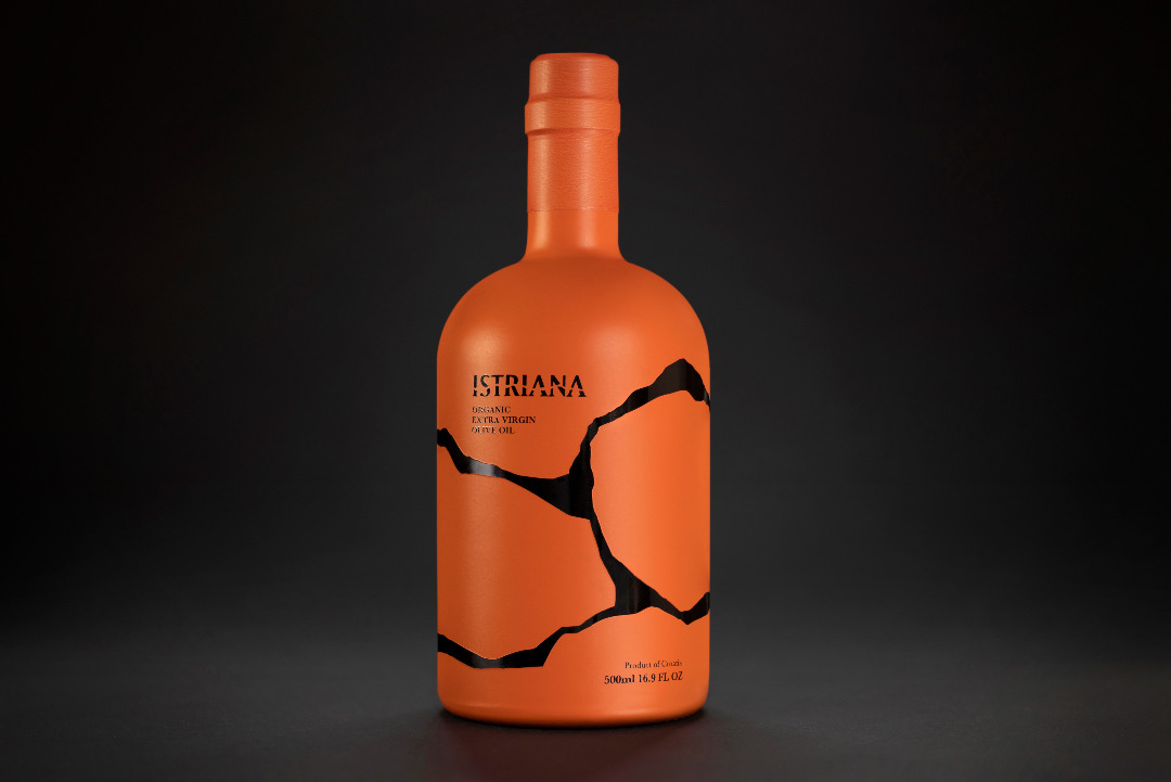
Gold for The Best of Use of Colour Award by PANTONE: Istriana by STUDIO TUMPIC/PRENC. Image courtesy of Pentawards
Pentawards, an international packaging design competition now in its 17th year, is embracing what it means to color outside of the lines. In collaboration with PANTONE, it has unveiled a special inaugural prize celebrating designers who think out of the box, literally, with their exceptional use of hues. These innovative players were announced during the event’s gala ceremony held in London on November 10.
Some notable trends observed in the world of packaging design include bold visual messaging to promote recycling practices, interactive and eco-friendly unboxing experiences using paper, and designs aimed at inspiring positive actions.
Crowned as the very first recipient of a gold prize for the Best Use of Color awards, introduced in partnership with the color authority, is Croatian design agency Studio Tumpic/Prenc with its creation, Istriana.
Gold for The Best of Use of Colour Award by PANTONE: Istriana by STUDIO TUMPIC/PRENC. Image courtesy of Pentawards
This unique bottle design draws inspiration from the authentic shape of Roman amphorae used to store olive oil in the Istrian region. The packaging ingeniously reassembles ancient clay pieces, with the terracotta-orange color on the packaging derived from Istrian soil itself.
Other winners in this vibrant new category include BYCOLOR Dental Beauty by Aekyung Industry and Doritos Rainbow Limited Edition 2022 by PepsiCo, both earning silver.
View this post on Instagram
Mozzo Coffee by B&B Studio and BY FAR: The Daydream Fragrance Collection by Vincent Villeger were recognized with bronze for their outstanding experimentation with color.
View this post on Instagram
View this post on Instagram
Out of 600 entries shortlisted for the broader competition this year, 25 were selected for the Best Use of Color title, each one recognized for making a significant impact in their respective markets through innovative design and color choices.
“It’s been a hugely exciting year for Pentawards, not only due to the caliber of entries, but also with the announcement of our partnership with PANTONE and the introduction of a new category which allows us to celebrate arguably one of the most visually arresting aspects of packaging design—color,” remarks Adam Ryan, Head of Pentawards. “With noticeable trends also emerging and a continuing focus on designing with interaction, purpose and action in mind, it’s such an exciting time for packaging design and it’s an honor to celebrate it each year.”
[via Pentawards, images via various sources]
by rrollins

Recent Comments